The Beginning of the End! Course 5 Final

It’s been a good journey but I am also excited to see it coming to an end.  Experimenting with flipping a couple of lessons in my Art 7 classes has been a great way for me to wrap things up. I love the idea of using technology in my room but I’m also very conscious of the fact that I don’t want to take away from the students time to get their hands dirty with the creative process. I’ve found that when I flip a lesson in my class I am actually creating more time for students to get their hands dirty.  Even better is that the time I have created for them to work on their art is also time that I can be standing by to help them when they need a little extra guidance.

When all was said and done I would have to say that I felt the most success with my flipped lesson on negative space.  Take a look.

Yes it takes some time to make the video but I am hoping that as I work with the tools more frequently the process will speed up. Even though making a video is time consuming my goals were met and then some, making it all worth it.

  1. Students had more time in class to complete there work.
  2. Students had their iPads out on there desks and were able to refer to the tutorial for review while working rather than asking me to repeat something.
  3. Because student had access to the tutorial while working they didn’t need as much assistance from me.  This gave me more time to work with students who were needing extra help.
  4. 39 of 42 students had their entry tickets and knew exactly what to do when they entered the class.  It was wonderful to see everyone come in and get straight to work.
  5. I learned a lot about the different tools I used to make the video.
  6. Student understanding of the concepts being taught was much higher than in previous semesters. I can see this because concepts taught in this lesson have been continually used by students when discussing works of art.
  7. Less classroom management was needed because students were not required to listen to me lecture and demonstrate.

As you can see there are many positive outcomes to my flipped experience.  A lot of this is also attributed to the thoughtful planning that went into the lesson.  I did flip another lesson a few weeks after my initial negative space lesson.  I have to admit that this lesson was not as successful.  I believe the reason for this was because the lesson was not one that needed flipping. I did not see a significant different in the outcome of the student work.  I also don’t feel that the technology actually helped to explain the concepts being taught any more clearly than when previously taught. That being said I don’t believe that all lessons should be flipped but flipping the right lesson will get the desired results.

Here is my Ubd framework for planning this project, as well my video explaining a bit more about my process.  I hope my work will give you a little insight into flipping some lessons of your own.


Stop Motion 101

Earlier this year I was given the opportunity to teach a stop motion animation class. I had taught stop motion to 5th graders before but this was to be an entire middle school semester focussing on stop motion animation.  With it being my first time teaching animation on this level there were certainly some ups and downs thought the semester. With that being said I am excited to be teaching it again next year.   I thought I would take this opportunity to share a little about the process we used and what I learned as a rookie.

  1. Start out by making sure that students understand the stop motion process.  It’s good to have an understanding of FPS (frames per second) and how many photos are actually required for each shot.  It’s also important to understand how many small movements happen within just a couple of seconds.  We did this by looking at other simple stop motions and flip books.
  2. Students should work in groups of 2 or 3.  Often times 4 is too many unless you are animating people doing supernatural things.
  3. Have students brainstorm their overall story along with props and materials they will need before they story board. This will help them to get a better grasp on what they might be able accomplish within the time frame they have.
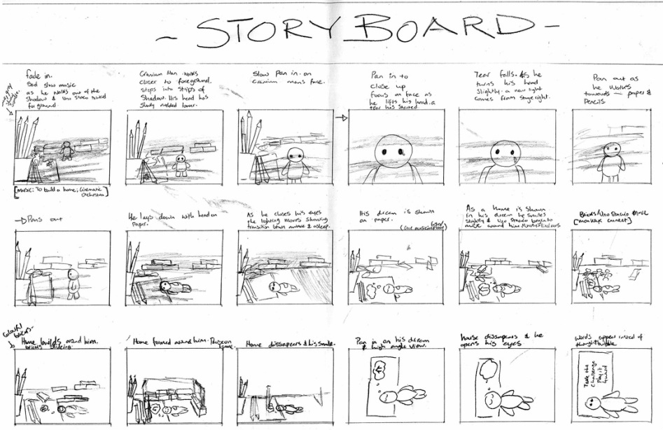
  4. Never underestimate the importance of a detailed story board. If students don’t think through their whole process while storyboarding they are going to struggle when making props and shooting pictures. The groups that were the most successful with there final product had beautiful story boards and those that were not so successful had story boards that were not only extremely minimal in detail but also did not resemble the final product. Students with poorly detailed story boards quickly learned from their shortcomings and were sure to put more thought into the storyboarding process in there next animations.

    Ruth Emma Design
  5. When working on set design often have students look at what they are making though the camera lens to make sure it will fit properly.  Often times students will make props too small and they are not noticeable through the camera.  This makes size and scale extremely important.  Another common issue is that student often make props that will be animated but have not put thought into how to keep the prop stationary for the shooting process.  This is a big issue that needs to be properly thought out before they get to far into the construction of the props.
  6. When shooting your pictures students should all have different roles. One person should be behind the camera and direct and the others as puppetiers.  They can take turns in these roles but often times you will find that some people are better as the camera man and tend to get the job done faster. Another thing to always keep in mind when shooting is you light source.  Shadows and changing light sources can often be overlooked by students and need to be kept in the forefront of their mind because shadows are not usually noticeable until many pictures have all ready been taken.

In the end what helped students to understand some of these details of the process before making mistakes of there own was constant pre-critiquing.  We got in the habit of starting class with older student examples I had collected.  It was often very easy to pick out little ways these could be improved but most importantly students were able to see how important attention to detail is.

I hope that some of you will find this overview of my process, along with some tips peppered in, to be helpful.  I’m a firm believer in the many many skills that can be learned through the stop motion process but I won’t get into all of that right now.  Should you choose to get your hands dirty I wish you the best of luck.

Enjoy this super cute animation by some of my students.  This was the groups first dabble with the process.

Reflection Time

As I read through the course material for week 1 of course 4 I’ve been asking myself a lot of questions about the type of technology I use and where do I fall on the TPACK framework or SAMR model.  One reading that particularly caught my interests was Jeff Utecht’s blog post on evaluating our technology use in the classroom. I thought it would be worth my while to give myself a little evaluation.  Over the course of one 8 block cycle I kept a log of all the different ways that technology was being used in my classes.  Many of my classes are using technology in similar ways. Using Jeff’s evaluations questions I would say that most of the technology used in my classroom fall’s between “using technology to do old things in new ways” and “technology creating new and different learning experiences for the students”.

I would have to admit that most of what we are doing is probably closer to the “using technology to do old things in new ways” category.  Here are some examples from my classes.

    1. A Daily Prezi: I keep a rather detailed prezi as a scope and sequence for all of my classes.  This is a nice little daily overview of what we will be doing for the period as well as outcomes.  I like to project this up for the period so that students can refer back to it as needed.  It is also a nice way for me to keep any videos, pictures or other information linked to the lesson right there with my scope and sequence. Giving the kids a daily overview of the class schedule and outcomes is nothing new but prezi has provided me with a better way of organizing large amounts of information as I move from class to class. I have yet to do this but prezi can also be shared online.  I have often wondered if it would be helpful to students to have access to my prezis so they can look back at what we covered or get a glimpse of what they missed when absent.
    2. Google Slides Portfolio: New to my classroom this year are online portfolios.  Instead of using a portfolio website I have decided to use google slides.  The reason for this is that the student and I can share the slide presentation which makes is easy for me to comment and help edit. It’s also nicely organized through hapara. The third reason I like to use this format is so that I can embed all of my students portfolios onto my blog.  This has been a great way for students to view others work and furthermore for parents to view student work. Presentation is a very important part of any art class and this format has allowed me to take it to another level without always hanging work in the halls.  Here is an example of a student portfolio from my art Studio Class.

I could go on through my list of ways we are using technology in the classroom but I think I will stop there for now.  These two example stick out to me because they are being used on a daily basis. I would love to hear some of your thought on these practices.  Where do you think these practices lie on some of the models discussed in Course 4?  Do you have any ideas as to how they could be brought to the next level?  These are practices that I see myself continuing to implement and smooth out over the next year. I would love to hear your feedback.


Remix your childhood favorites

We have been talking about Remixes and Mashups in our Coetails classes off and on for some time now.  It’s been great discussion for me because as an art teacher I can bring these concepts into almost any of my classes with very little effort. Two of my finals units  now have incorporated some sort of remix or mashup into the students final product.  I’ve found the students to be incredibly motivated and creative at the same time.  As I move forward to create an animation class next year I am positive that these themes will continue to creep into my curriculum.

What I love about the buzz around mashups and remixes in todays culture is that this is nothing new to the art world.  I can talk about these things with my students as a very easy segway into the history of appropriation in the arts. According to MoMA appropriation is the intentional borrowing, copying, and alteration of preexisting images and objects. It’s been a part of western art for centuries but its a style that has rapidly increased with the rise of consumerism. Jonathan Lethem’s article in Harper’s Magazine “The Ecstasy of Influence” nicely describes how appropriation has been a part of the arts for a long time in many different ways. If you think remixing is anything new then check this article out.  I personally find that using the word remix is just what helps me to relate to my students.  From there we are able to dig a little bit deeper.

Using the word Remix also brings me to the idea of having a good hook for your students. I was recently introduced to a concept referred to as Fan Art. Again, to me this is another form of appropriation or if I was trying to pull in my students I would say Fan Art is another form of remixing.  If you are unsure about what Fan Art is watch this OffBook short from PBS.

The thing I love about fan art is that so many people start out drawing fan art when they are little.  When kids or even adults don’t know what to draw they will draw a character that they know from some sort of work of fiction. If you want to get a little creative you could draw them doing something new or out of character. I would say that about 70% of the independent drawings that my students do in their sketchbooks are fan art from their favorite shows. Fan art is yet another genre that falls under appropriation that I can easily use to stir up some creativity with my students.  I’m not sure where all this is going just yet but I’ve got high hopes for all the places appropriation in it’s many forms will take my classes in the future.

ReVamp

I recently took a little survey with my design class to see what type of project they would be interested in pursuing as we wrap up the semester.  At our school all of the students have blogs that are used regularly so I thought one of the options should be to revamp their blogs and give them some more visual appeal.  I was surprised to find that the idea of adding a personal touch to their blogs was very enticing to whole class.  Several students claimed to have never done a single thing to their blogs because nobody ever showed them how.  The level of enthusiasm for this project got me excited to develop this unit but I was even more excited because it so nicely brought us back to all of the design elements that we have been discussing throughout the semester.

To kick of the unit we watched the OffBook video on “the Art of Wed Design”.  Side note, if you are not familiar with OffBook I highly recommend it. It is a great collection of shorts put together by PBS on Art in the Digital world.

This video gives a little history about web design and at the same time helps to generate some discussion about basic elements to consider when designing a web site. Some of these elements were typography, usability, layout, content, and color.  With these things in mind students took a look at their own blogs and asked themselves two questions.

  1. What bugs me about my blog?
  2. If I could do anything what would I like to change about my blog?

After our mini brainstorming sessions we will be dug a little deeper.  The second phase to our research process was to look at the article Understanding Visual Hierarchy in Web Design by Brandon Jones. Students opened the article in an app that allowed them to annotate it in order to highlighting what they felt were the key components to each section.  Afterward we took turns sharing what we highlighted for extra clarity. With this new information in mind students were then asked to return to their lists of things that bugged them and things they wanted to change to make any further clarifications or add-ons.

With a complete list in hand of ways to move forward we will set out to do make three major changes.  Students will:

  1. Pick a new theme
    1. As students began looking deeper into wordpress themes they will have their lists of what they would like to change as well as their knowledge of the elements of good web design to help guide them.
  2. Reorganize your content
    1. Students will make sure the content fits into the new theme in a user friendly and aesthetically pleasing way. Some of these changes will include but are not limited to the following:
      1. adding categories to posts.
      2. Making a Home page more like an about me page.
      3. Parenting posts and ordering pages.
      4. Adding or subtracting widgets.
      5. Adjusting the layout of columns, scrollbars and posts.
  3. Design a new header
    1. We will use our adobe suite skills to create a new personalized header. We have been using many of the adobe suite products throughout the semester and students have done a great job developing their skills with digital imagery. They are allowed to use their own images, create a mashup, remix of an image using creative commons.

QR_design_spagettiAt the moment my students are about half way through revamping their blogs.  Fun things are happening and I’m excited to see the end results.  As kids finish up they will be posting a reflection to explain the reasoning behind all of their changes.  I know thier have been a lot of little bumps in the road where students find they are not always able to do everything they want but this has been a good lesson as well.

In the end I’m most excited because this final project that accomplishes several things. First, it teaches the students several new concepts about web design. Second, it reviews many of the key components and tools that we have been building on all semester. Finally and most importantly  this unit allows for the student to put some individuality and personal flare into a product that they will be continuing to use in the future.

Start with the story

As an art teacher it is not the visual part that gets lost.  My actual title is “Visual Arts Teacher” so if I’m lacking in visuals  when it comes to storytelling then I’m not doing my job.  The part that I feel is left out of  the Visual Arts Classroom way too often these days is the story. Art teachers often have their students create exciting images that completely lack narration. To often, especially in the elementary art scene, you see the students making 25 versions of the same idea. There is no personal story coming from the artist/students. At AES I have been working very hard in several of my classes to make sure the artist is telling the story they want to tell.  I’m simply showing them how to use tools that will help them to do so. Isn’t this how real artist make art in the first place?  I often wonder why idea this so often lost in the art room?

In most of my art classes I want to make sure that students are connected to what they are making and that connections usually come from a personal narration.  This is where I am constantly trying to enhance what is happening in my room.  This is also where I see myself turning to writing teachers. We create our context for our images by coming up with a story. I actually do this by giving students prompts to reflect on experiences and write about them.  By continuing to reflecting on those brief writings of experiences and memories student are able to form their own expressionistic visuals. In this case and in most other works of art the artist is starting with the story, not the image. As a result students are more invested and the product is more visually enchanting.

I’m in the process of creating a new class titled Art in Animation.  When the subject of course 3 turned to Digital Storytelling my mind obviously went toward the creation of this class. Yet again, the visual is not the challenging part for me, it’s the story.  I have found from past experiences that when starting an animation project storyboarding is of extreme importance. I’m sure it is the same for any form of Digital Storytelling. Storyboarding is not all that different from the beginning stages of creating a Zen Presentation.  The story needs to come first. Afterall, Movies don’t start with pictures they start with screenplays, and before that they often start with a book. I was actually in the middle of putting this post together when I discovered Garr Reynold’s blog post just this week on storyboarding.  I urge you to check it out.  In it he shares many video clips that show how storyboarding works.  The following clip video that Garr shared in his post is the very one that first introduced storyboarding to me when I was a bit younger. I can recall watching this mini documentary when I was in high school and was convinced that storyboarding illustration would be the perfect job for me.

Can Flashy Prezi be Zen?

I use Prezi very frequently in my classroom. While reading about presentation Zen I noticed all of the examples being displayed were powerpoint or something similar. This got me wondering; Can Prezi be Zen? I decided to do a little fishing around to see what some others critiques might have to say about the Zen qualities or lack there of when it comes to Prezi.

I started with the creator of Presentation Zen, Garr Reynolds.  From what I found Reynolds had two main positive things to say about Prezi:

One is that “ Prezi is a good tool when used with discretion and restraint.”

and that

“Prezi works well in non-linear presentation situations”

The first quote by Reynolds could easily be applied to any presentation platform, or any tool in general for that matter.  The second however is the one that I find to be more relevant.   In a way Prezi’s can be set up like an animated infographic. Prezi will zoom into one section of the whole and then zoom out again to show the viewer how everything is connected, helping the viewer to never lose sight of the big picture. Like Garr said, it works well with non-linear situations.

Not everyone though seems to think that Prezi has the potential that Reynolds does. Scott Burkun has a post dedicated to his hatred of Prezi. Stating that:

“The people most drawn to use Prezi are those who are more enchanted by the pretense of style, rather than substance.”

Burkun’s statement may be true for many Prezi users but who’s to say those users are in any way knowledgeable with the concepts behind Presentation Zen.  From what I read the biggest critisism of Prezi is that the transitions are to flashy, distracting the viewer from the content. These transitions definitely go against the Presentations Zen model. They are what I believe Reynolds was referring to when he said that Prezi is a good when used with discretion and restraint.  So are there Zen Prezi’s? Chris Anderson has a wonderful Prezi that he uses in his TedTalk on how web video powers global innovation and I would say it’s getting the job done.

https://embed.ted.com/talks/chris_anderson_how_web_video_powers_global_innovation.html

In this presentation you can see many of the advantages to Prezi as well as the distracting transitions. My conclusion is that when creating a Zen presentation there can be a place for Prezi but you should think carefully about the content and whether or not a non-linear presentation platform enhances your content.

On the other hand I don’t use Prezi just for presentations and talks.  I’m sure that a lot of presentations that teachers make are not so much presentations as they are reference points for students. I actually use Prezi as a sort of weekly planner that helps to organize the information my students need for each class. I have one Prezi for every week that encompasses all of my classes. Different areas of the Prezi are dedicated to providing the students with images, video or links they might need but mostly it is a way to communicate what the class period will consist of along with some key points.  If it was only visuals it wouldn’t be very helpful to students. In this way Prezi is not being used for presentations but it is a reference for my students. Since I have started using Prezi here are what I have found to be it’s advantages, Zen or not.

  1. You can create a presentation that is are non-linear, displaying the big picture and how concept overlap and are interconnected.

  2. Prezi is web based so it can be accessed from different devices and has a user friendly app.

  3. It can be kept in the public domain so it can also be accessed by your students.

  4. Embedding video, images and links is extremely easy and allows you to keep more information in one place.

  5. It can be shared with others to make presentations a collaborative effort.

I would like to leave you with a course relevant  Prezi example that may not be exactly Zen but it nicely displays that advantage of Prezi without the Presenter. This is something prezi can do well when needed.

https://prezi.com/embed/bm9alx1pbtmc/?bgcolor=ffffff&lock_to_path=0&autoplay=0&autohide_ctrls=0&features=undefined&disabled_features=undefined

Breaking Down the Walls

Picture courtesy of Visual Thinking Strategies

I’m enjoying the topic of course 3 because I feel visual literacy is often overlooked and yet increasingly essential.  I would argue however that visual literacy is being taught more than most realize and it’s happening in the art room. Visual literacy and sometimes media literacy are core subjects in the art room. George Lucas stated in his  Edutopia article that “We need to take art and music out of “the arts class” and put it into the English class.” This statement points to what I believe is a largely overlooked problem in schools today. I believe each subject tends to be too compartmentalized when in reality, outside school walls the world is not run by lone subject matters but more often a collaboration of subject matters.  Visual literacy doesn’t need to come out of the art room and go into english class. Teachers need to demonstrate how subject areas overlap more naturally. Many teachers do this to a small extent but kids still don’t make the connections. When you tell a student to make a visual for a science class do they stop to apply the elements and principles of art the learned in drawing? Mostly likely the answer is no. I often think that if our school systems were set up with less compartmentalization between subjects then our students would be more equipped to see how everything is intertwined and overlapping. If only we could break down some of the walls between our subject areas.  Then, just maybe students would be more likely to apply visual media and literacy skills they have been nurturing in the art room to observations in literature, science and technology.

As an art teacher I thought I would attempt to start this process by sharing some simple tools that I use to enhance visual literacy. Hopefully a few of you will find this useful in a classroom outside the art room.

  1. VTS, otherwise known as Visual thinking Strategies is a great way to get kids verbally talking about imagery, breaking down there thoughts and expressing them out load.  One thing I love about VTS is that there are no wrong answers, just curiosities and self expression which helps kids to build there confidence. The following is a video of VTS being facilitated with a group of adults. 
  2.  “Picture This: How Pictures Work” by Molly Bang is a wonderful book that shows how simple shapes in different arrangements create expression.
  3. The Elements of Art and Principles of Design are considered to be the common set of vocabulary for talking about and describing visual components of a work of art.  This vocabulary is used in art classes from kindergarden through 12th grade and could easily be used in other classrooms when looking at, creating visuals, or developing descriptive writing

I hope some of my non art teacher colleges might find some of this useful. If you have materials that you think would make a good resource in the art room I would certainly like to hear about it.


Appropriate dress

This semester I’m teaching a design class and I’m finding myself in new territory.  I’m constantly focused on making our projects to be meaningful and relevant. One very relevant project we were recently working on in class was designing a new cover for next years school agendas.   In a way the class was hired to a job with very specific criteria and functionality. Knowing this we took our task very seriously. Students broke off into small groups to work on their ideas, periodically regrouping to discuss design elements until we came up with something that we all agreed was aesthetically pleasing as good design. I feel the project was a huge success, used a collaborative design process, and helped students to become more familiar with Adobe InDesign.

agenda cover design by AES MS Design class


One little bug  popped up in the process that brought me back to our copyright discussions in CoeTail. We started out our design process with a set of images that we owned.  At one point students wanted to use other images and began grabbing things off the internet without thinking twice. I quickly realized that in a class where we are constantly on the computer and we are working with layout and design that copyright needs to be addressed. As a matter of fact I should probably be addressing it in all of my art classes to some degree since appropriation is a common artistic practice.  With this thought in mind I have decided that the introduction to our next design project, which is t-shirt design, will begin with concepts of appropriation, copyright and remix culture. We have just finished creating our own personalized logos and have published them to our blogs.  Ownership of their own work and fair use of others are things that each of my students should be considering at this point.

This unit will be introduced to my students by addressing the issue we ran into a few weeks ago when images were taken from the internet for our cover project. The class will be broken up into groups of two, with each group researching one of the following topics and reporting back to the class.

soup can parody courtesy of Wikimedia
  • Explain copyright and who it is meant to protect.
  • What is appropriation? Give 3 examples of famous artists using appropriation in their work.
  • Tell us about Andy Warhol and one of the copyright lawsuits he was involved in.
  • What are considered the fair use and artistic standards for artists involving copyright?
  • Give two possible scenarios where copyright would affect us in Design class.

Once we have all been informed of each others topics we will take a closer look at our schools RUP. This will give the students time to not only review the RUP but also discuss what points in the RUP relate closely to our work in Design.

It is at this final point in the discussion that I will introduce students to Creative Commons, it’s purpose and how we should be using it from here on out. Creative Commons has two wonderful videos that I plan to share with the students to not only explain what Creative Commons is but also how they have contributed to the remix culture of modern artistic appropriation. The following is the first of those two videos. With help from the Creative Commons search engine we will be finding images to turn into remixed graphics on Adobe illustrator. Our final graphics should also be changed according to artistic standards of copyright so that they could be legally printed onto a t-shirt or submitted to a design company such as threadless.com.

I’m excited for students to do their own research into this topic and see how copyright enters the visual art world. I’m also excited to hear the discussions that might follow. This unit will being within the next two weeks in my class, stay tuned for updates.


Augmented Artist Statement

As an art teacher I’m always trying to get kids to talk about art and the visual world around us.  There are so many strategies that I have learned over the years to help kids to do this but I am always looking for new ideas.  In my classes students are often talking about their processes and doing reflective writing as their project comes to a close.  Still, I often feel that communicating their ideas and processes verbally is extremely important and not practiced enough in school.

Aurasma is an app that allows students to create a visual overlay onto an existing image by scanning it much like you would a QR code.   With Aurasma students are able to videotape themselves talking about their art work rather than writing.  I prefer this as an art teacher because as I stated before I want kids to be able to express their ideas and what they are seeing verbally.

Here is a Ted talk to help better illustrate Aurasma.
https://embed.ted.com/talks/matt_mills_image_recognition_that_triggers_augmented_reality.html

Presentation is another important component in the art room.  By augmented arts statements students are adding a new interactive element to their presentation that allows the viewer to see and hear the artists perspective or thought process. As time goes on I hope to explore many of the other possibilities that Aurasma has to offer.

For this project students will be video recording their artist statements to help enhance their verbal presentation skills.  They will then use their art work as a trigger image for their video statement to appear on the mobile device in use.  When these works of art are on displayed in a gallery or in the halls of our school any student or parent who has subscribed to our classroom channel can learn more about the artist intent and process.